Brewing Up Success: How Graph & Grind Cafe Uses Capable's Diagram Feature
September 24, 2024
James Bridge
Building on our previous blog post 'Introducing Our New Visual Editor: Diagrams for Everyone in Confluence!' we’d now like to highlight a few practical examples of how this feature can be applied in business environments.
While designing the diagram feature, we found it essential to create some fictional scenarios to thoroughly test its functionality. This allowed us to ensure that the tool would be adaptable and effective for real-world business needs.
Give this page a read to check out how Graph & Grind (our coffee house alter ego) used our Diagram feature to caffeinate their Marketing, Sales and Customer Experience.
Introduction - Perking Up Our Tool
Like a coffee taste test — you got to make sure it’s just right before serving it up! The team at Capable are massive coffee heads, maybe that’s why the letter C for Coffee, Caffeine and Copious Cups of Joe made it’s way into our name. With this in mind, we dreamed up a fictional eco-friendly premium coffee company in need of diagram tool to help with their planning.
But first, a question for you reader. Blending the themes of diagrams and coffee, which name do you think is the best fit for our fictional company?

It goes without saying, perhaps Diagrind represents one of the unwanted side-effects of drinking too much coffee too strongly, so that's it's big no from me on that one. Personally, I like “Graph and Grind” because it reflects both our passion for hard work and our attention to detail. The word “graph” suggests a methodical, almost scientific approach to our coffee-making process, while “grind” represents the dedication we put into perfecting every aspect of what we do.
With Capable for Confluence’s Diagrams, you can visualize every step of your strategy, making teamwork smoother than your creamiest Columbian cup. Keep reading to see how Graph & Grind Coffee harnesses the power of our diagram tool to elevate their planning.

Whiteboarding - Sip and Sketch
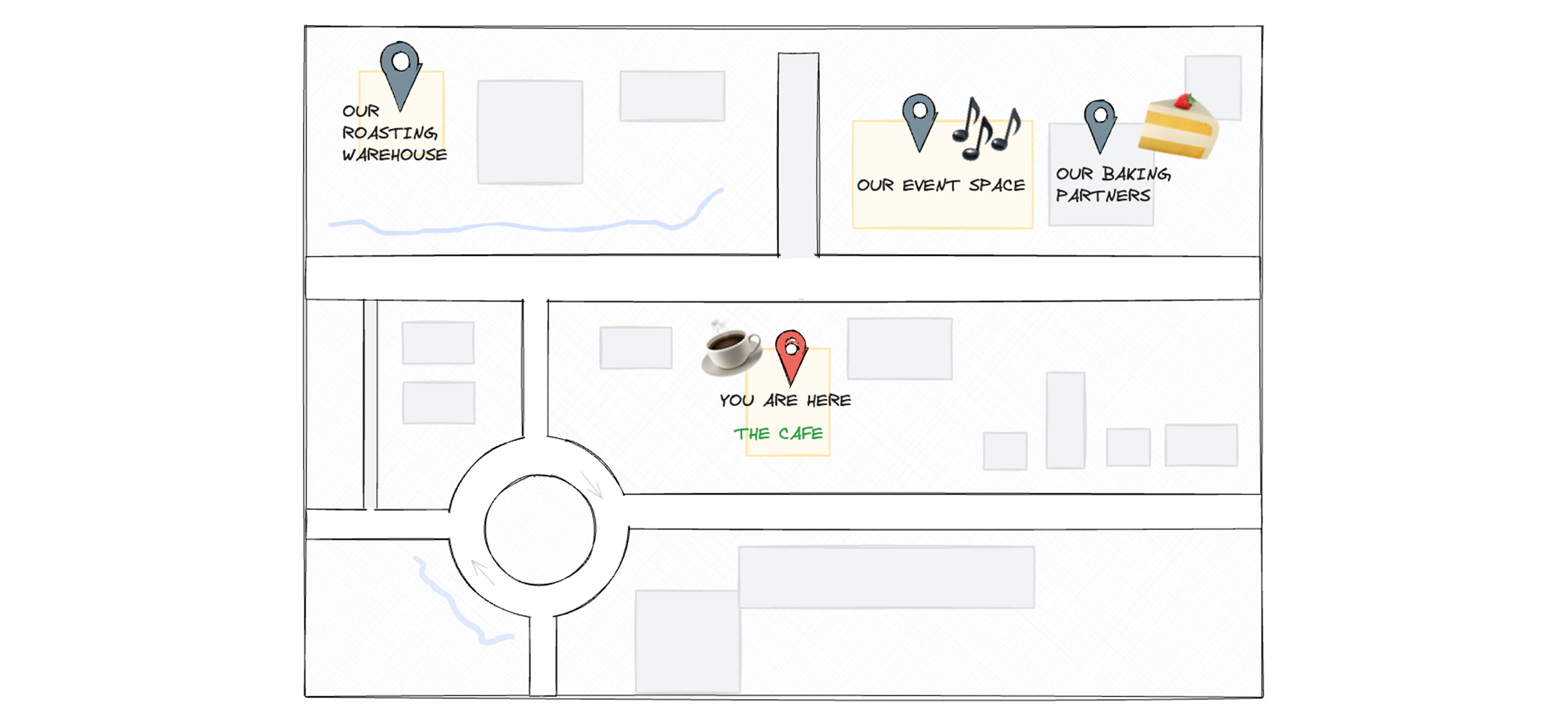
The Cafe Community Map
A neighborhood map showcasing a café’s partners, like local bakers, roasters, and event spaces, is not only visually exciting but also adds tremendous value to the café experience. It connects the café to its community, giving customers a sense of local collaboration and authenticity. By highlighting partnerships, the map fosters a deeper relationship with customers who appreciate supporting local businesses. Additionally, it enhances the café’s storytelling, offering a more engaging and memorable experience as patrons learn about the origins of their favorite pastries or coffee beans. Visually, it adds an artistic, personalized touch to the space, making the café feel more rooted and connected to its surrounding neighborhood.
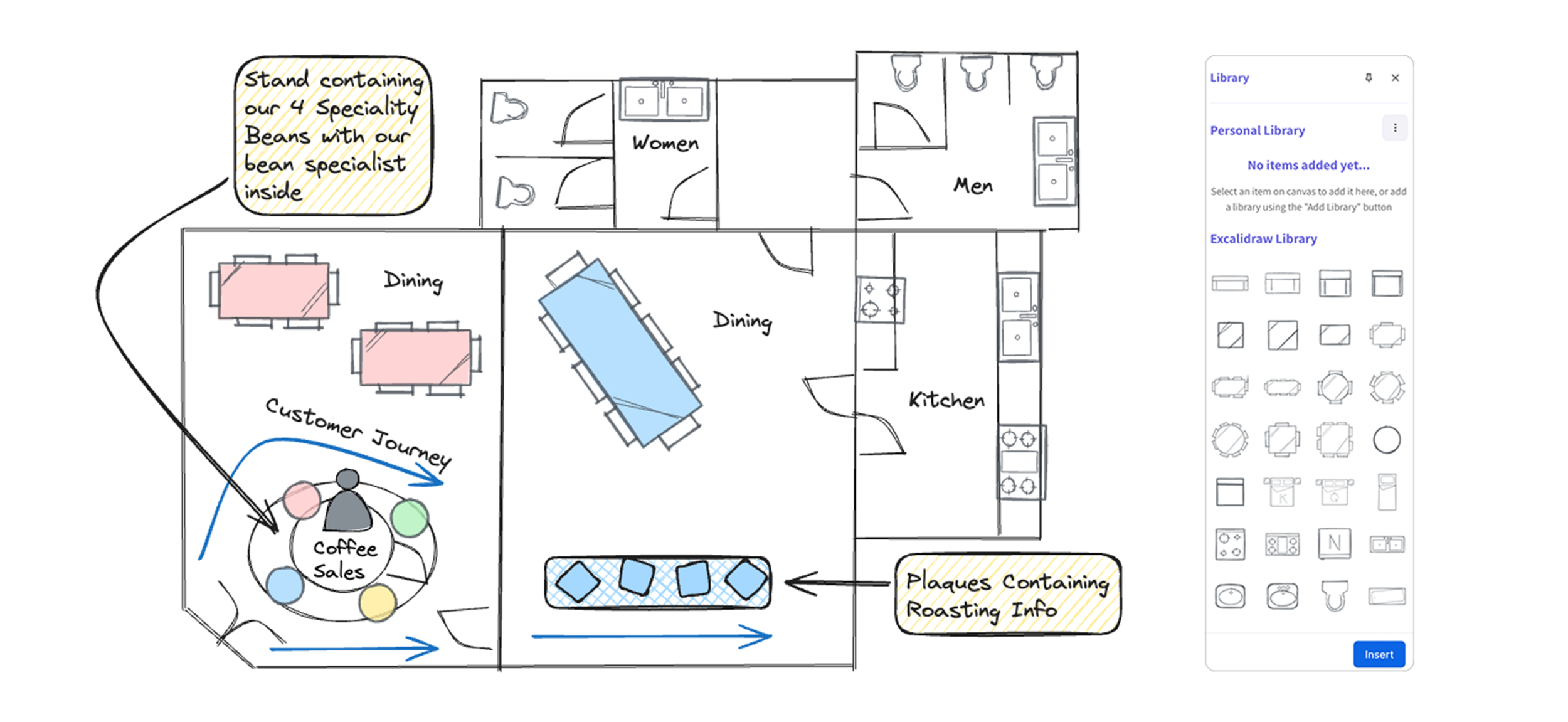
Customer Journey Floorplan
At Graph and Grind Cafe, we aim to enhance the customer experience by creating a well-designed floor plan that fosters a welcoming and comfortable ambiance. By carefully spacing seating, defining areas like sales desks and communal tables, and ensuring easy access to amenities such as restrooms, we can create an inviting environment for all customers, including those with disabilities. Additionally, by mapping out the entire customer journey—from entry to exit—we can identify key touchpoints to further enhance their experience, ensuring every visit to Graph and Grind is seamless, inclusive, and enjoyable.
This was created using our visual editor which allowed for easy drag and drop of interior design assets from the libraries. Our Diagram feature offers a vast collection of 211+ pre-made components, shapes, and objects, making it easy to import and reuse them in your designs. And with new libraries continuously being added, the options keep growing. Libraries include: Mockup Frames and UI Elements, AWS and Azure Icon Libraries, Flowchart and BPMN Libraries and C4 Model for Architecture Diagrams. You can read more about this on our last blog - 'Introducing Our New Visual Editor: Diagrams for Everyone in Confluence!'
Processes - Pathway to Perculation
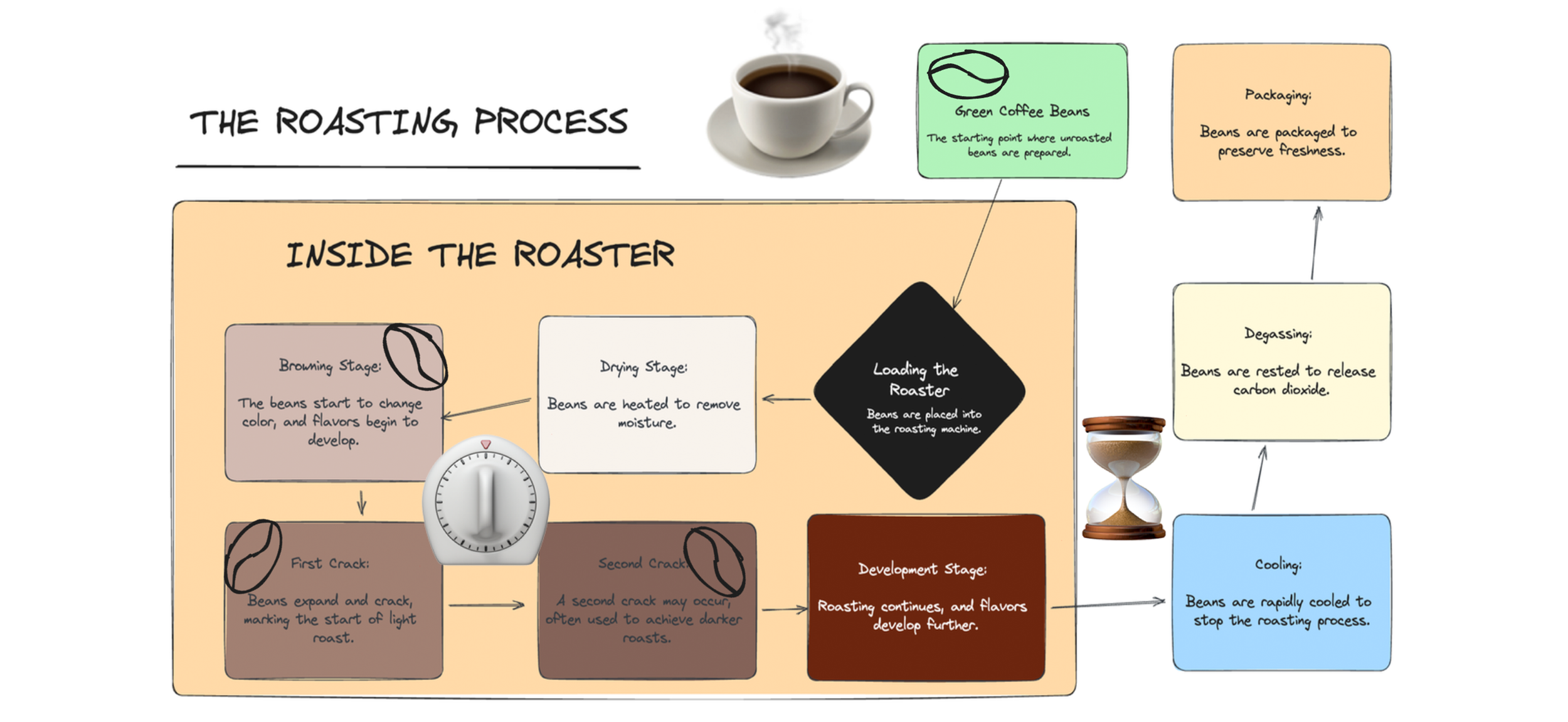
The Roast Route
Graph and Grind is on a mission to showcase the journey their coffee beans take from green to golden brown with a “Roast Route” diagram. Capable Diagrams Visual Editor allows them to do exactly that, creating a flowchart which traces every step of the roasting process used by their expert partners, guiding viewers through the sequence with clear, easy-to-follow arrows. Each stage is represented by its own box or shape, ensuring that even the most complex processes are broken down into simple, digestible steps. The use of colors and shapes not only makes the diagram visually engaging but also highlights different stages or actions. Plus, there’s flexibility to add notes or symbols, like temperature or time, to capture those crucial roasting details.
Data - Bean by Bean
Radar for Flavour
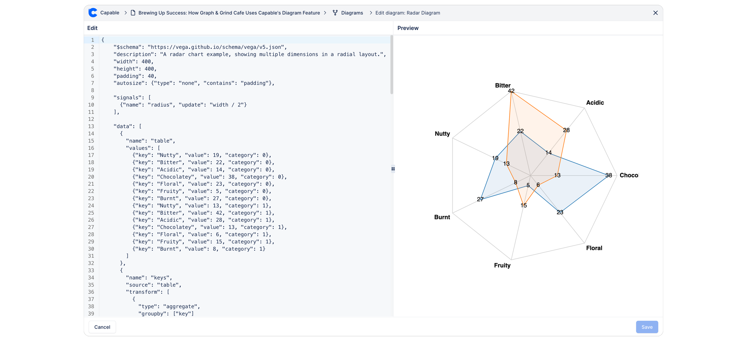
A Spider Chart (or Radar Chart) is a great diagram that brings coffee tasting notes to life with a bit of flair. Multiple axes radiating from a central point, each representing a different tasting note—whether it’s fruity, nutty, floral, earthy, or chocolatey. For this we used our Code Editor allowing us to simply type in the different bean names into the code dropdown and let Capable Diagrams do the rest. With data-driven visuals, teams can represent complex data clearly and concisely, improving decision-making. This code-based approach allows easy integration, automation, and updates, saving time. Plus, its wide range of chart types makes it perfect for visualizing various business data in an engaging way and easily transfer data points onto different types of graph.
By plotting the intensity of each note on these axes and connecting the dots, you get a shape that visually captures the coffee’s flavor profile. This chart offers a comprehensive overview at a glance, making it easy to see how balanced a coffee is across various flavors. Plus, you can overlay multiple profiles for comparison, giving both novices and experts a quick, insightful look at the complexity and depth of each brew.
Pouring Over the Numbers
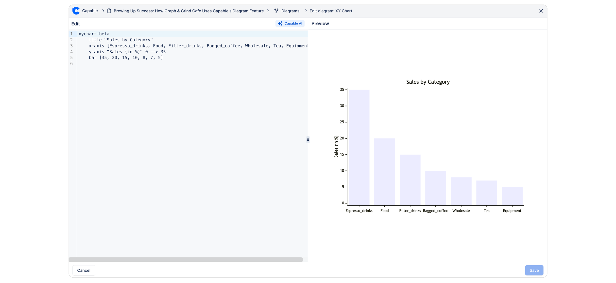
A bar chart is the perfect way to showcase the different types of coffee and how many units of each have flown off the shelves. It’s simple yet powerful, with each bar representing the sales volume for a particular coffee type. The taller the bar, the more popular the brew—making it super easy to see which coffees are customer favorites and which might need a little extra love. Plus, we added some flair by color-coding the bars and displaying trends over time. Whether you’re analyzing sales, managing inventory, or planning your next big promotion, a bar chart serves it all up with clarity and style.
Rovo for Pie's (and other Food)
Capable Diagrams now integrates with Atlassian Rovo, Atlassian's new AI assistant, allowing users to create interactive diagrams faster than ever before. With this integration, Rovo can analyze the content of your Confluence page and use that information to automatically generate a diagram based on a simple text prompt.
Whether you're summarizing a project's structure or mapping out an architecture, you no longer need to manually gather all the data or start from scratch. Just provide Rovo with a prompt, and it will intelligently build a visual diagram that reflects the information already present on your page.
By combining Capable Diagrams' powerful editor with Rovo's AI-driven capabilities, you can transform complex information into clear, interactive diagrams with ease—perfect for both technical and non-technical users.
Conclusion
In conclusion, Capable Diagrams provides businesses like Graph & Grind Cafe with powerful, customizable tools for visualizing everything from coffee origins to roasting processes and tasting notes. By turning complex data into clear, interactive visuals, businesses can enhance their planning, improve decision-making, and elevate customer experiences. Whether it’s creating a flowchart of operations or crafting a spider chart of flavor profiles, Capable Diagrams streamlines the process, ensuring clarity, consistency, and efficiency every step of the way.
How could your business take advantage of our Diagrams feature? Whether it’s to visualize workflows, map customer journeys, create organizational charts, or showcase project timelines, we’d love to hear about it!
Even better, send us some examples of how you’ve used the tool to transform your processes. Your creativity could inspire others to do the same!
%20copy.png)


