Boosting Efficiency in Team Meetings with Capable Diagrams (Part 1)
Riding the Wave of Organizational Improvement
At SoundWave, a leading headphones manufacturer, teams constantly juggle projects across design, engineering, and marketing. Jacob, our resident Process Optimization Specialist, has a front-row view of the company’s workflow challenges. His role is to create processes that make teams more efficient, adaptable, and organized, but recently, he’s observed a troubling trend: teams are getting bogged down with workflow jams, scattered documents, and disorganized information. This lack of coherence not only causes frustration but is also beginning to affect team morale and overall performance.
The Marketing Team’s Static: Disorganized Data and Chaotic Meetings
Jacob sees bottlenecks everywhere—from compatibility issues with legacy systems to fragmented data migration practices. The marketing team, for instance, is doing a fantastic job at promoting SoundWave’s products, yet their department meetings are taking twice as long as they should. Why? Each regional and national marketing lead brings a different set of graphs and data presentations, often in separate tabs. This disjointed setup, with employees constantly switching between tabs and apps, results in a cumbersome and inefficient meeting process.
Tuning into the Problem: Frustration and Workflow Jams
Jacob’s colleague, John, SoundWave’s Director of Marketing, is particularly affected. Each week, he meets with his team to review their social media performance in a high-profile meeting where the CEO, CMO, Performance Reviewers and senior marketing VPs are present. Given the presence of these senior leaders, it’s especially important for John to present a streamlined and professional overview of his department’s performance. However, each team member ends up sharing different tabs and software for their graphs, with sections like “Overview,” “What’s Been Achieved,” “This Week’s Focus,” and “Discussions.” When it’s time to discuss performance metrics, each person brings up a new tab with graphs from different software, leading to delays, occasional mishaps like accidentally closing tabs, and generally creating a chaotic impression—despite their positive results.
Jacob knows this fractured approach paints the marketing team in a less-than-optimal light. The clutter of different charts, diagram software, and constant screen-sharing adjustments disrupts the meeting flow, causing unnecessary lag, confusion, and an overall sense of disorganization.
Jacob’s Sound Solution: Standardized Templates with Capable Diagrams
Given his role, Jacob is motivated to bring order to the chaos. He decides to leverage Capable Diagrams’ powerful capabilities for creating and storing custom templates. His goal is to ensure the marketing department has access to consistent, visually cohesive graph templates that can be easily updated and embedded directly into Confluence.
By working with Capable Diagrams, Jacob creates a centralized repository of templates within Confluence. Each template includes pre-set headings for relevant data points, such as social media engagement metrics, audience growth, and content performance.
How?
Step 1:
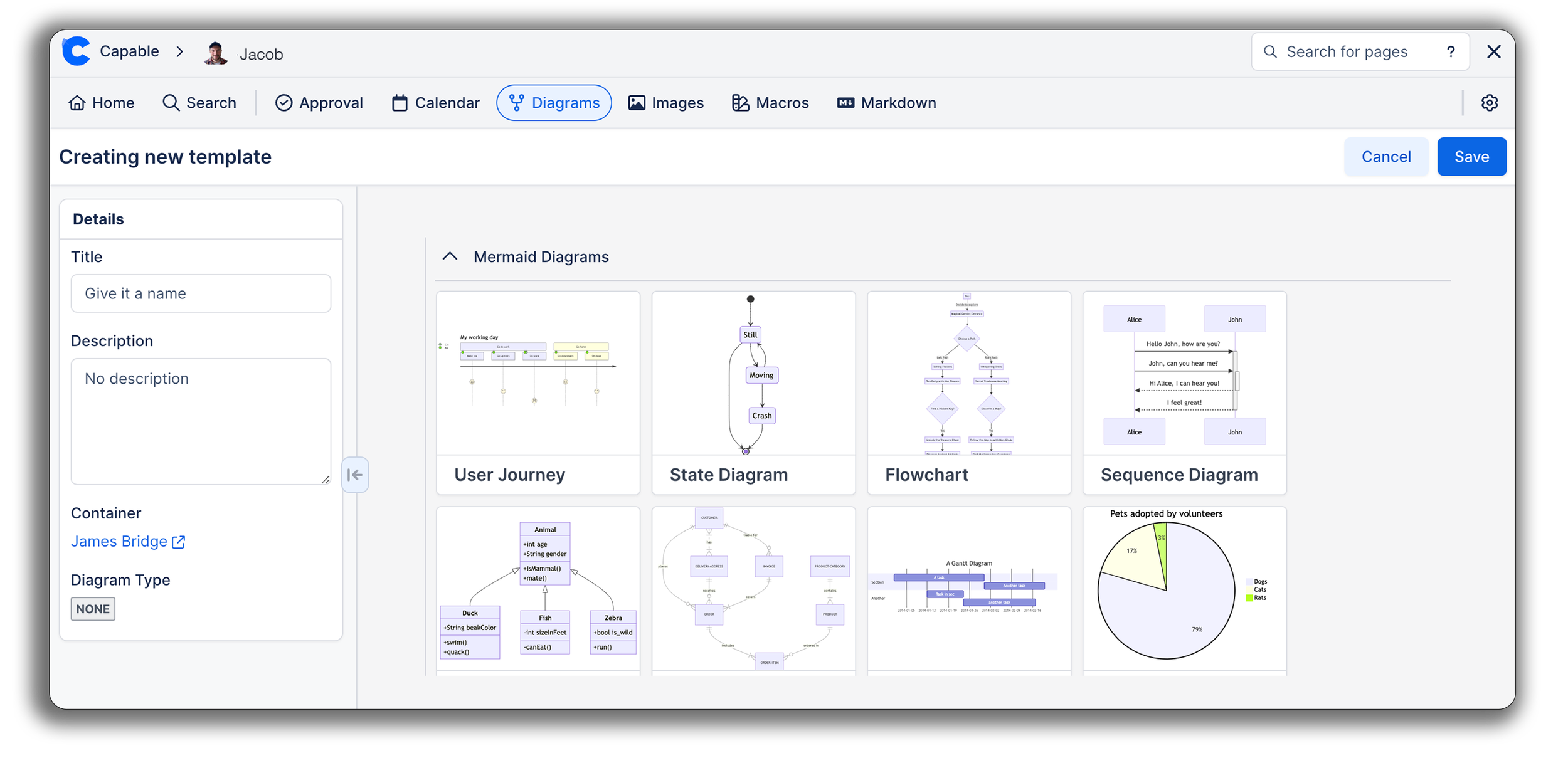
First he heads over to the Capable Dashboard, clicks on the companies shared 'Space' and then clicks 'create template’
Step 3:
Jacob chooses the Mermaid XY graph and inputs the data that the Marketing teams would be using. He teaches John to update these templates weekly, allowing team members to input current data without creating entirely new graphs.
Step 4:
Click “Save” to store your chart in your shared space, making it accessible to everyone. From there, it can be edited, duplicated, or deleted as needed. When on a Confluence page, the marketing team can simply use the Capable dot shortcut, select “Diagrams,” and insert any customized templates saved in the space directly onto their page.
Amplifying Efficiency by Embedding Templates in Confluence
To ensure a seamless experience during screen sharing, Jacob shows the team how to embed their graphs directly onto Confluence pages by clicking copy from the template menu and pasting it into a page. Now, when sharing a screen, there’s no need to switch tabs—everything they need is in one place, creating a polished, organized, and cohesive presentation for each meeting. You can even edit them right there from the Confluence page too.
AI-Powered Diagramming: A Glimpse of the Possibilities
Jacob also could have used Capable Diagrams’ AI-powered features, including Capable AI, Rovo integration, and the ChatGPT Diagram Assistant, to streamline and automate the creation of even more complex visuals. These tools allow users to generate polished diagrams using plain language or by analyzing content directly in Confluence. While Jacob relied primarily on templates this time, we’ll dive deeper into how these powerful AI tools can revolutionize workflows in Part 2.
Visual Editor: A Quick Note
While this blog focuses on the text-based tools of Capable Diagrams, it’s worth noting that Capable also offers a powerful Visual Editor for teams who prefer a hands-on, drag-and-drop approach. This feature is ideal for creating mindmaps, wireframes, and workflows, offering an intuitive interface and rich icon libraries for designing detailed visuals.
John, for example, could use the Visual Editor to quickly sketch out wireframes for social media posts or website banners, ensuring his team’s creative assets are clear, professional, and ready for execution. Though we’ll explore the text-based tools here, the Visual Editor remains a versatile option for non-technical users and creative projects.
Closing Chord
Jacob and John can now run their meetings smoothly, without the distractions of tab-switching and fragmented graphs. From a personal perspective, Jacob is pleased to see his initiative bringing efficiency and clarity to the team, while John is confident that his team’s hard work is finally reflected in their organized presentations. Teamwide, this improvement has boosted morale, allowing each member to focus on contributing meaningfully rather than getting bogged down by logistical frustrations. For SoundWave, it means higher productivity, happier teams, and a renewed focus on growth and innovation.
Try Now
All Capable apps are free for teams with up to 10 users and come with a free trial for all customers.
Want even more?
Explore Capable for Confluence — an all-in-one toolkit that includes Capable Diagrams and seven additional capabilities in one app with a clutter-free interface.
Say goodbye to multiple apps and hello to a Confluence multi-tool packed with the features you’ve been asking for.


